Create an app that can help provide the Kind Mind service and wellbeing program which aids employers in taking care of their employees and improving both the physical and mental wellness in the workplace.
To help companies monitor and improve the wellbeing of their employees through an anonymous service.
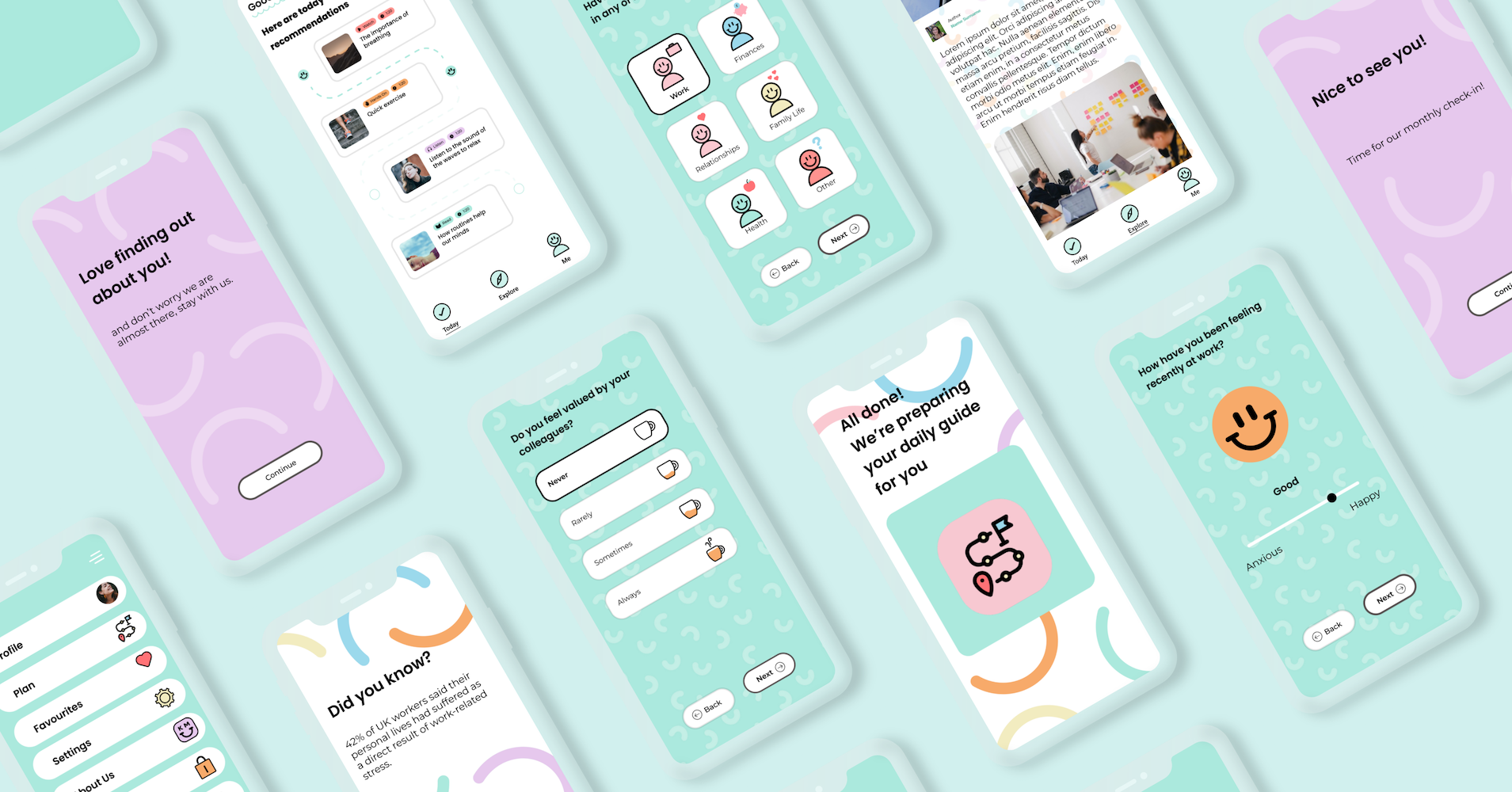
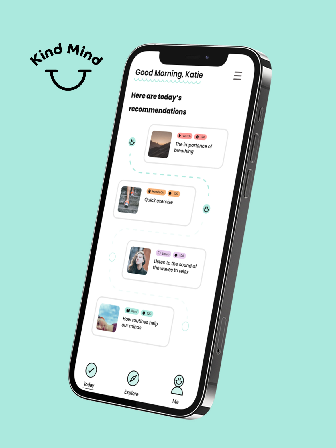
Provide content that can improve the employees’ wellbeing this included blogs, podcasts, and activities. The content needed to be updated, added and formatted throughout the process.
Creating an app that will maintain the number of returning users so the companies can continue to monitor the wellbeing of their workforce.

Creating an easy-to-use questionnaire for the user allows the content on the app to be delivered to the user tailored to their needs.
The data that is collected via the app is presented as a highly detailed monthly report. The monthly report is presented in an easy-to-digest format with graphs and charts. The reports show user uptake, anonymous results of the questionnaire, and patterns in their employees’ wellbeing.
Presenting the content on the app through a slick, easy-to-use user interface that any employee can get along with. Allowing the user to use all the features on the app. A backend was also built so the content can be edited and added by the admin.
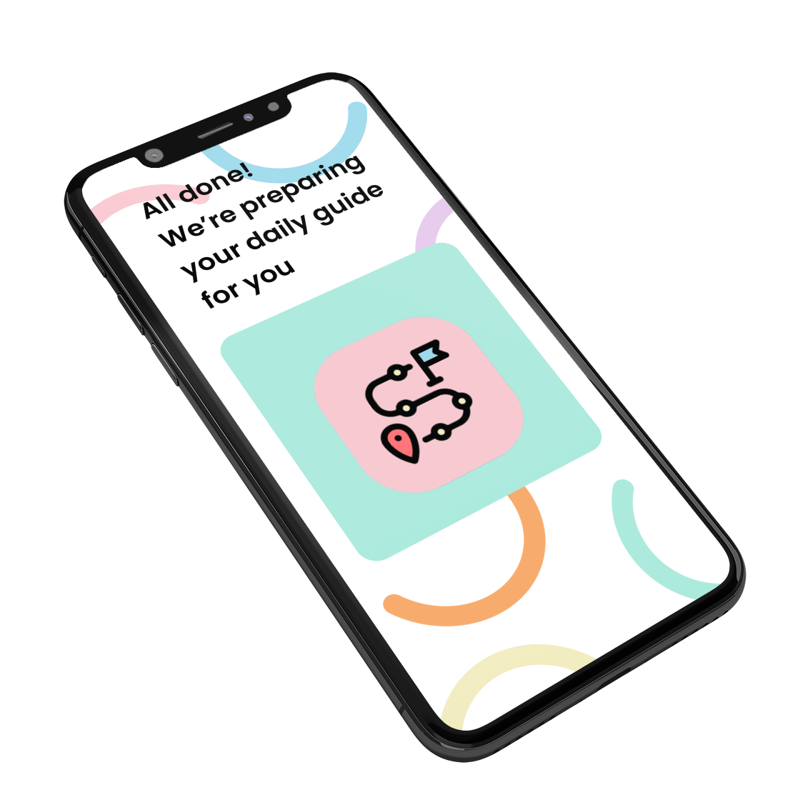
Ongoing content includes a monthly check-in to encourage the user to log back in so the content can remain recommended and useful for the user on their wellbeing journey.

The Kind Mind app can help employers to engage with their staff in a meaningful way. The implementation of the app allows employers and admin to manage and see the impact of the Kind Mind program with the employer dashboard, engagement resources, and measurement tools through periodic reporting.
Find out about the Kind Mind service here.
The target audience for Kind Mind is everyone of working age in any profession meaning with such a broad demographic the user interface and experience needed to be easy to use and the content easy to digest.
We achieved all of this through the use of pastel colours and iconography/graphics that remains consistent throughout the app to help with both navigation and the visual language of the app.
By following the iOS human interface guidelines we could guarantee that the app would be easy to navigate through.